Background
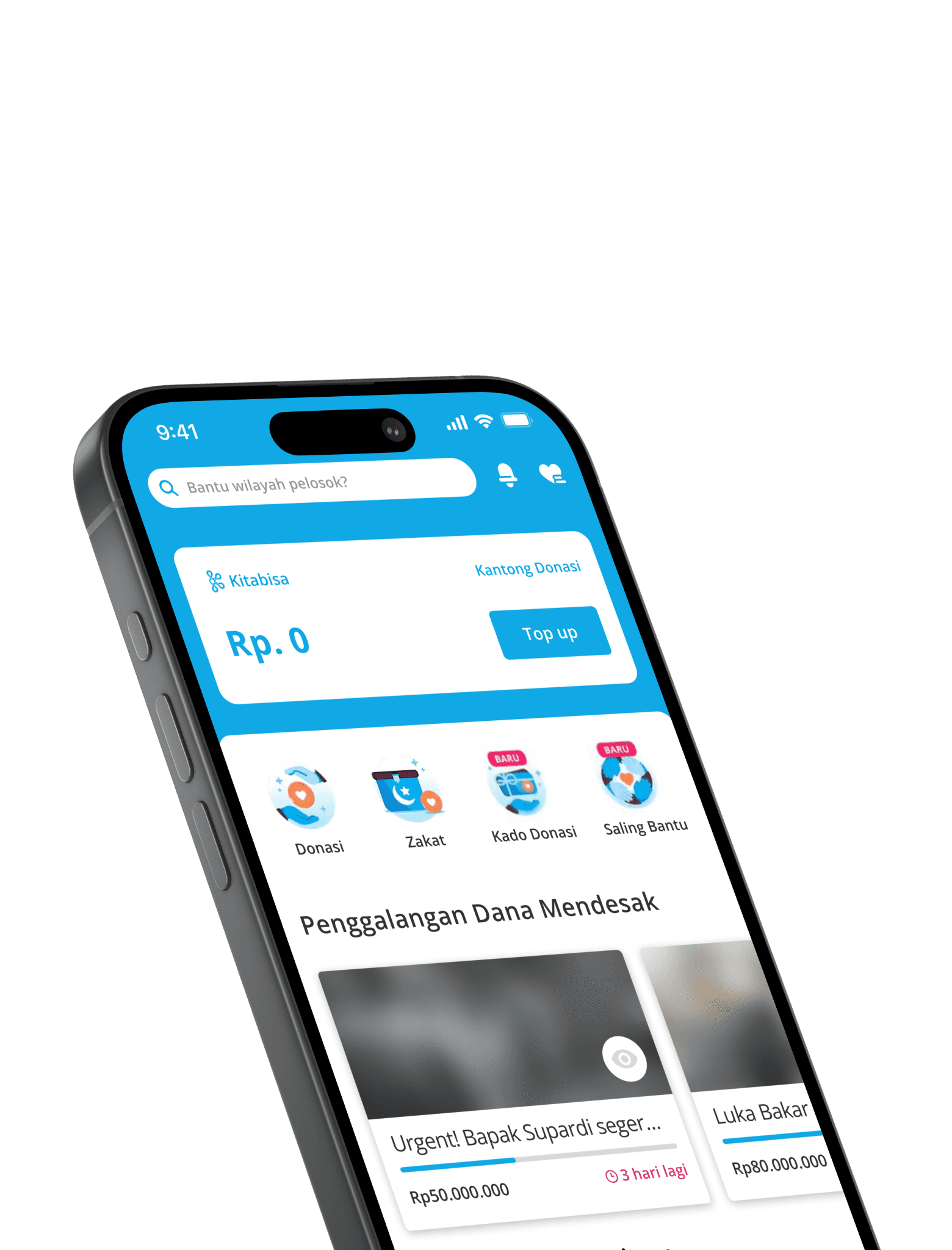
This project is held during the Merdeka Belajar Kampus Merdeka (MBKM) program in my 6th semester of university. I collaborated with 3 more students from all over Indonesia for approximately 3 months. I was given the opportunity to be a group leader. Together with the team, we implemented significant changes to the Kitabisa application, enhancing user experience through various new features such as short videos for fundraiser updates and a sensitive content filter to improve user comfort.
Problem
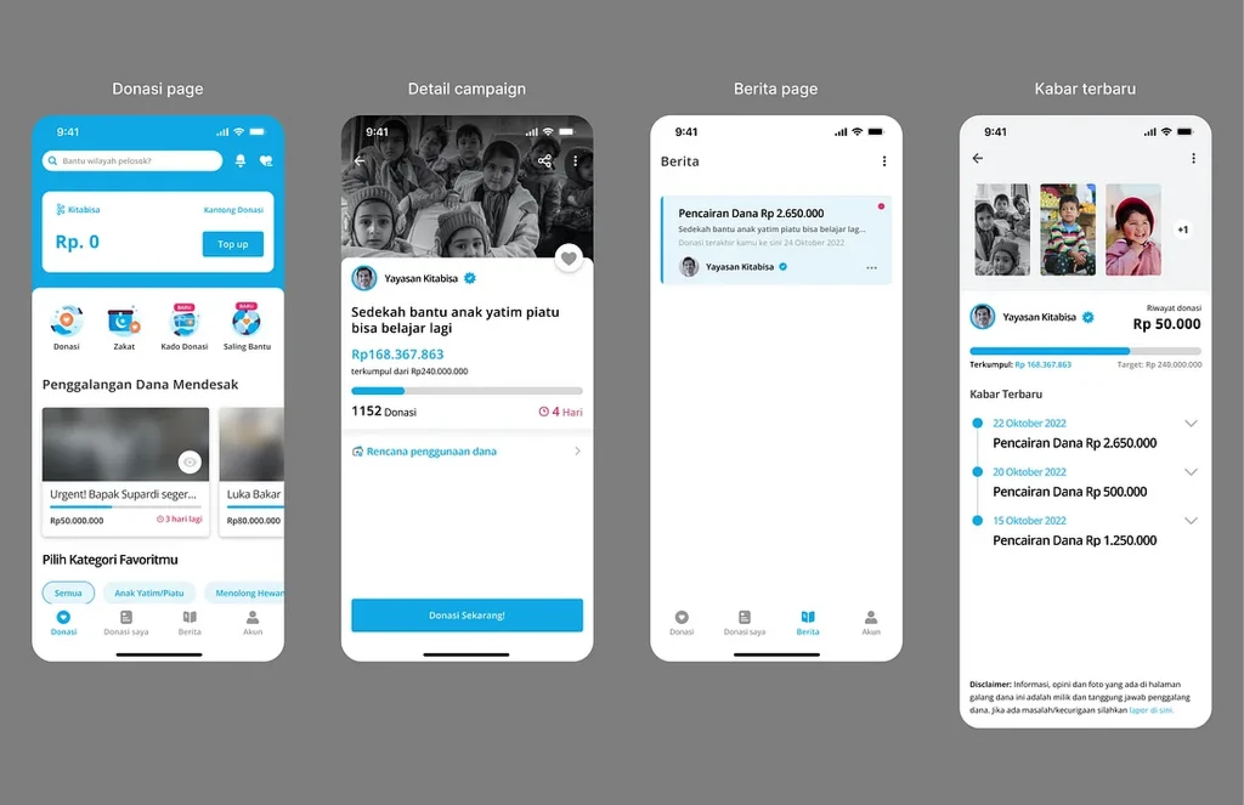
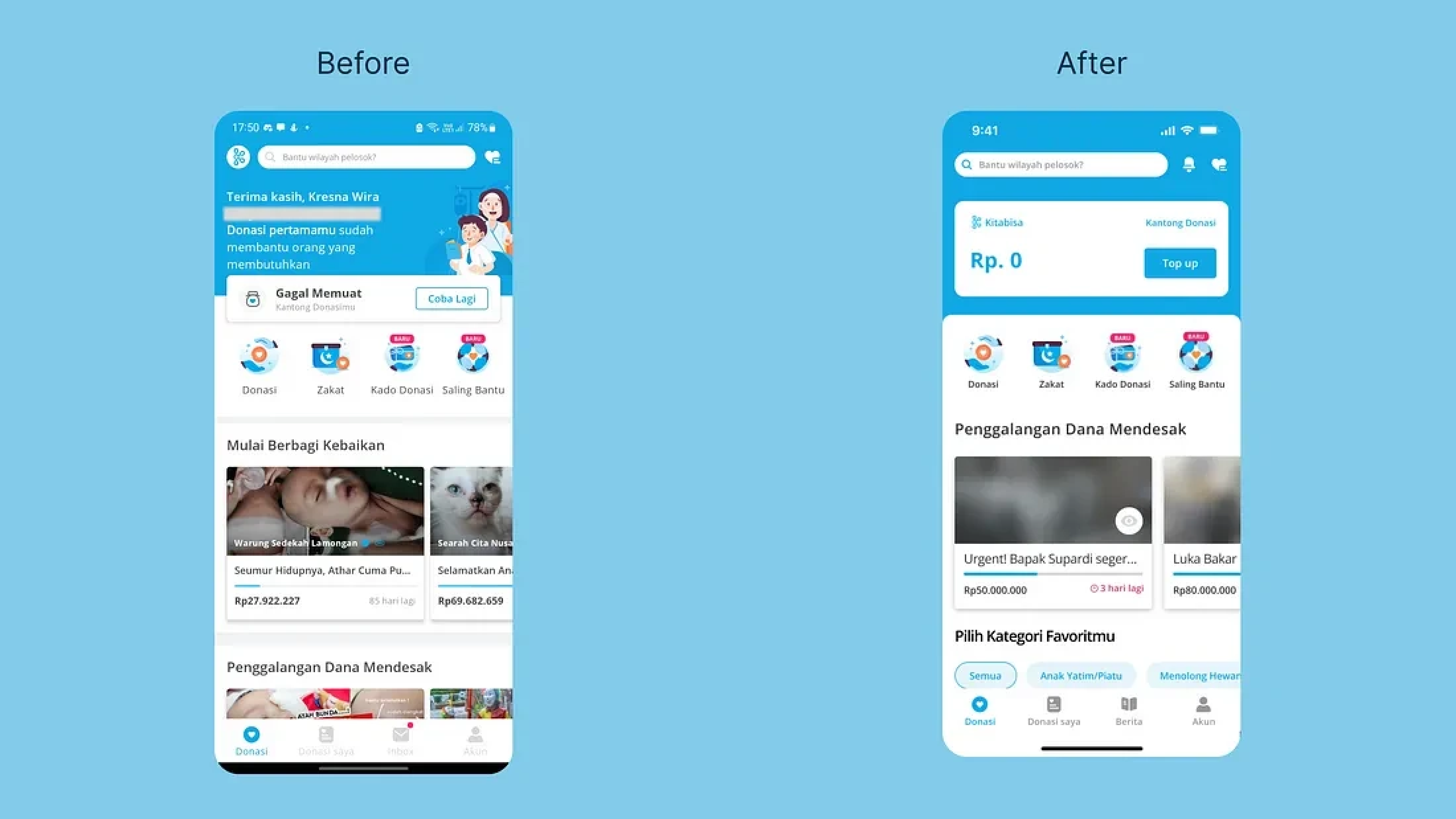
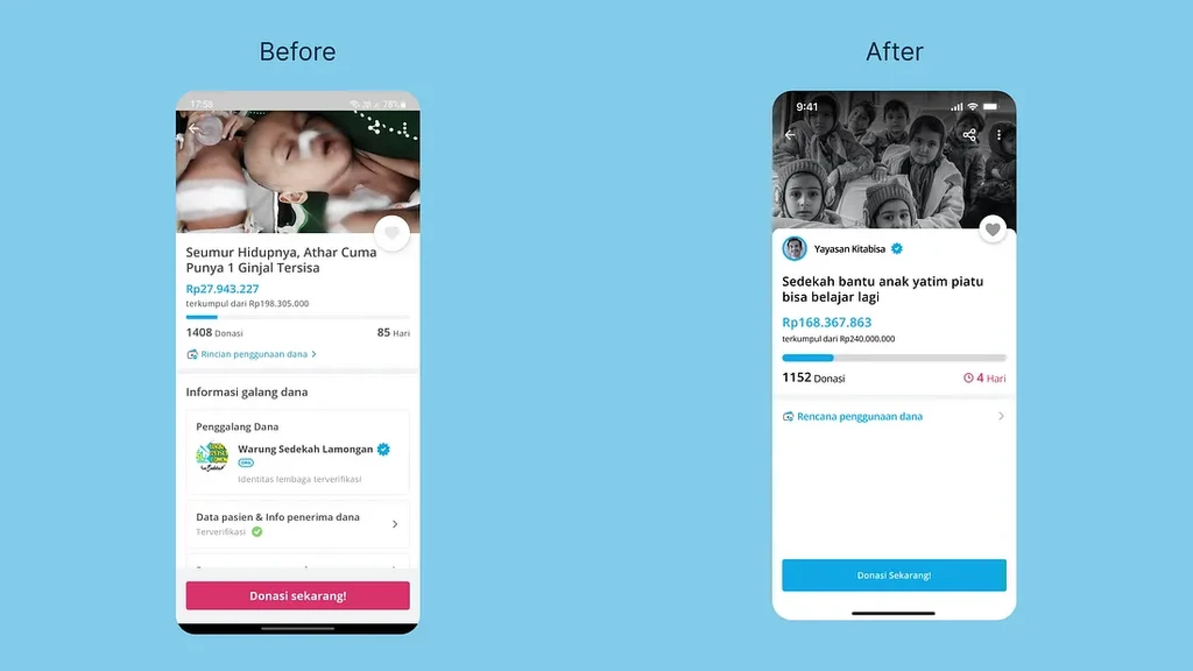
Kitabisa want to redesign or revamp their “News” section which can be found via the Inbox menu in the navigation then look at the News section next to the Messages section. “News” is their way of distributing information from the campaigns they have donated to. Not only that, the information provided can also be related to similar campaigns so that users can donate again to other campaigns.
Goals
Seamlessly connect donors with impactful updates
Streamline access to campaign news within the Inbox.
Employ a clear and engaging narrative format for updates.
Prioritize relevant content based on individual donor interests.
Deepen emotional engagement and donor loyalty
Highlight impact stories and beneficiary voices.
Showcase transparency in fund allocation and utilization.
Foster connections between donors and the causes they support.
Inspire continued giving and boost user retention
Make discovering related and impactful campaigns effortless.
Suggest personalized recommendations based on past donations.
Design an encouraging and motivating UI experience.
Solution
Bringing a new dimension to user experiences and interfaces.
Integrating with Advanced Technologies
New Possibilities
Based on the test results, the design successfully met the criteria desired by users by getting a score of 6 out of 7 on the Single Ease Question. This shows that the design is easy to use and understand by users.
A score of 6 out of 7 on the Single Ease Question means that users can complete the given task easily and without difficulty. This means that the design has successfully met the ease of use criteria, namely:
Clarity: Users can clearly understand what they have to do.
Ease: Users can easily complete the given task.
Suitability: Users feel that the design fits their needs.
By meeting these criteria, the design can increase user satisfaction and encourage them to use the product or service more sustainably.
(All images are based on what I've done)