
Background
As an HR employment app, worxspace adds to all in one tools that pool communication functions, smart personel, task management to the company directory.
Problem

Solution
Redesign a few pages of the worxspace app that covers:
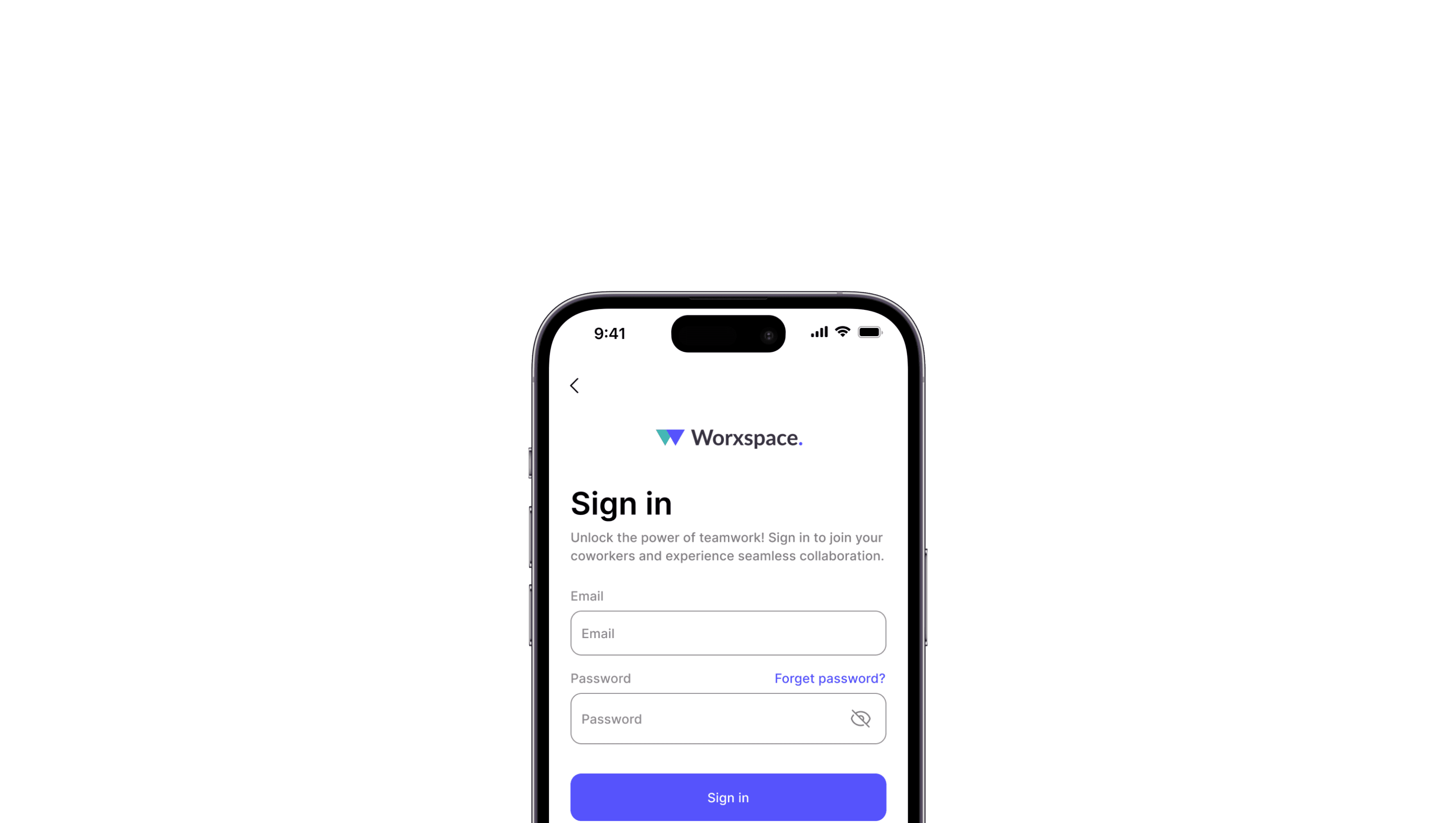
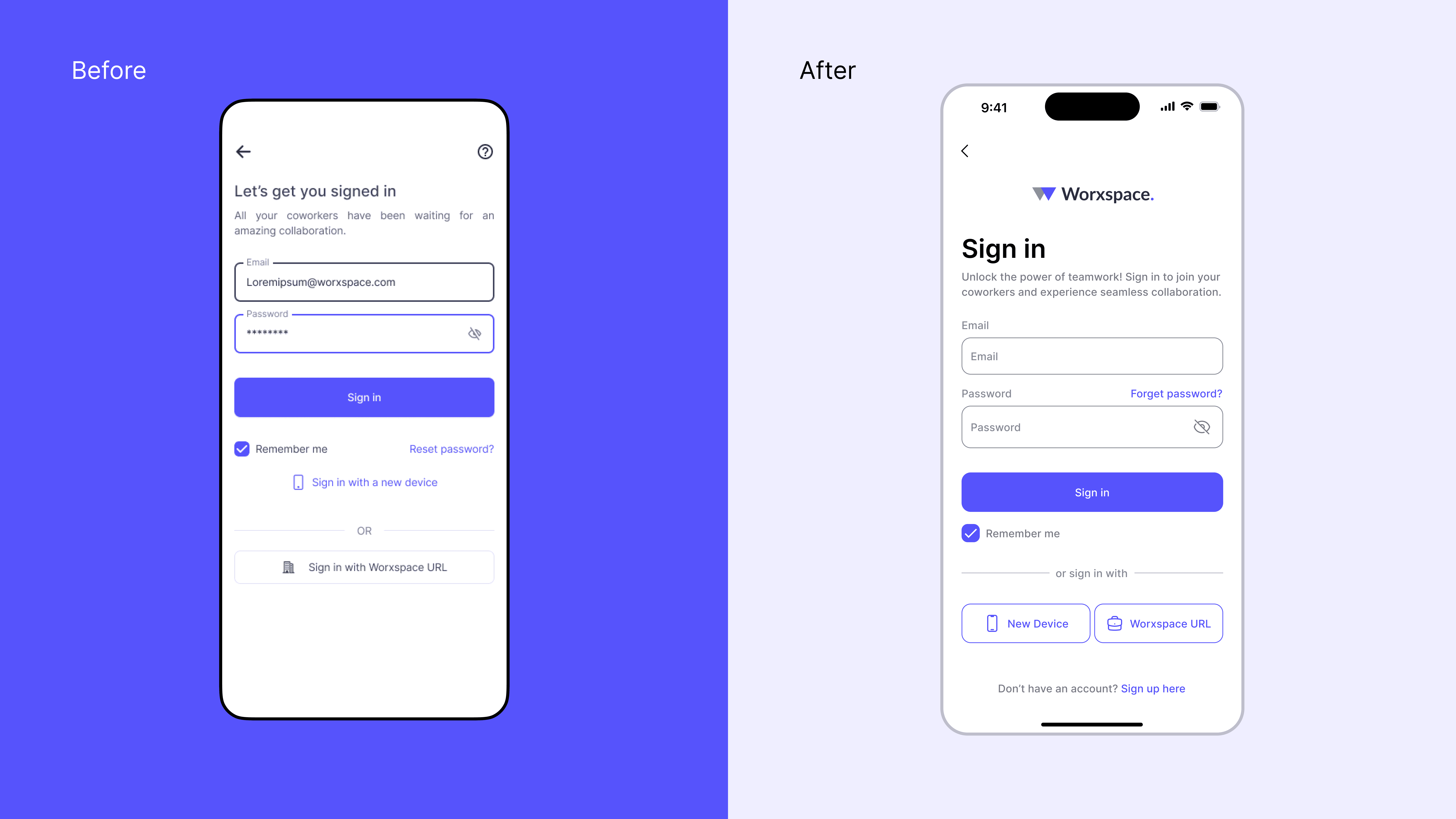
Login page
Home page
Task Page (List Task, Detail Task, and Create Task)
The login page redesign aims to create a familiar look while enhancing the clarity of the information hierarchy, making it easy for users to navigate and understand.
The initial home page design incorporates an abundance of primary colors, which can easily distract users and detract from the page’s primary functions. Simplifying the color scheme would help draw attention to essential elements and improve overall usability.

The redesign of the task page focuses on creating a clean and organized layout to ensure tasks remain easy to locate, even with a high volume displayed. By reducing visual clutter, users can quickly find and prioritize their tasks, improving their overall experience and efficiency in managing their workload. This simplified approach emphasizes clarity and usability.

When users create a new task, the page should feel concise and lightweight, avoiding an overwhelming or cluttered appearance. To address this, refreshing the core layout of the task input process can make it more streamlined and intuitive. A refined input design would help reduce visual load, making task creation quick and easy without adding unnecessary complexity.

Viewing detailed tasks is a core function of this app, so the information layout must remain light and accessible, avoiding an overwhelming appearance. If the page feels too dense, users may find it difficult to engage with tasks at a glance. To make the app more user-friendly, it’s essential to prioritize a clear information hierarchy, ensuring key details are prominent and easy to navigate. This approach will enhance usability by simplifying access to essential task information.
